My Network
My Network is the visual view of how your relationships actually flow. It plots every partner who has introduced someone to you (or to whom you've made an intro) as a node on a graph, draws lines for the intros that happened, and adds dollar signs where revenue followed. It's the tab to open when you want to see who in your network is doing the work, who's gone quiet, and where the gaps are.
Where to find it
Where to find it: Sidebar → My Network. Direct URL: /dashboard/my-network.
The page has three tabs: Graph, Actions, and Untapped. The Graph tab is the default.
How to read the graph
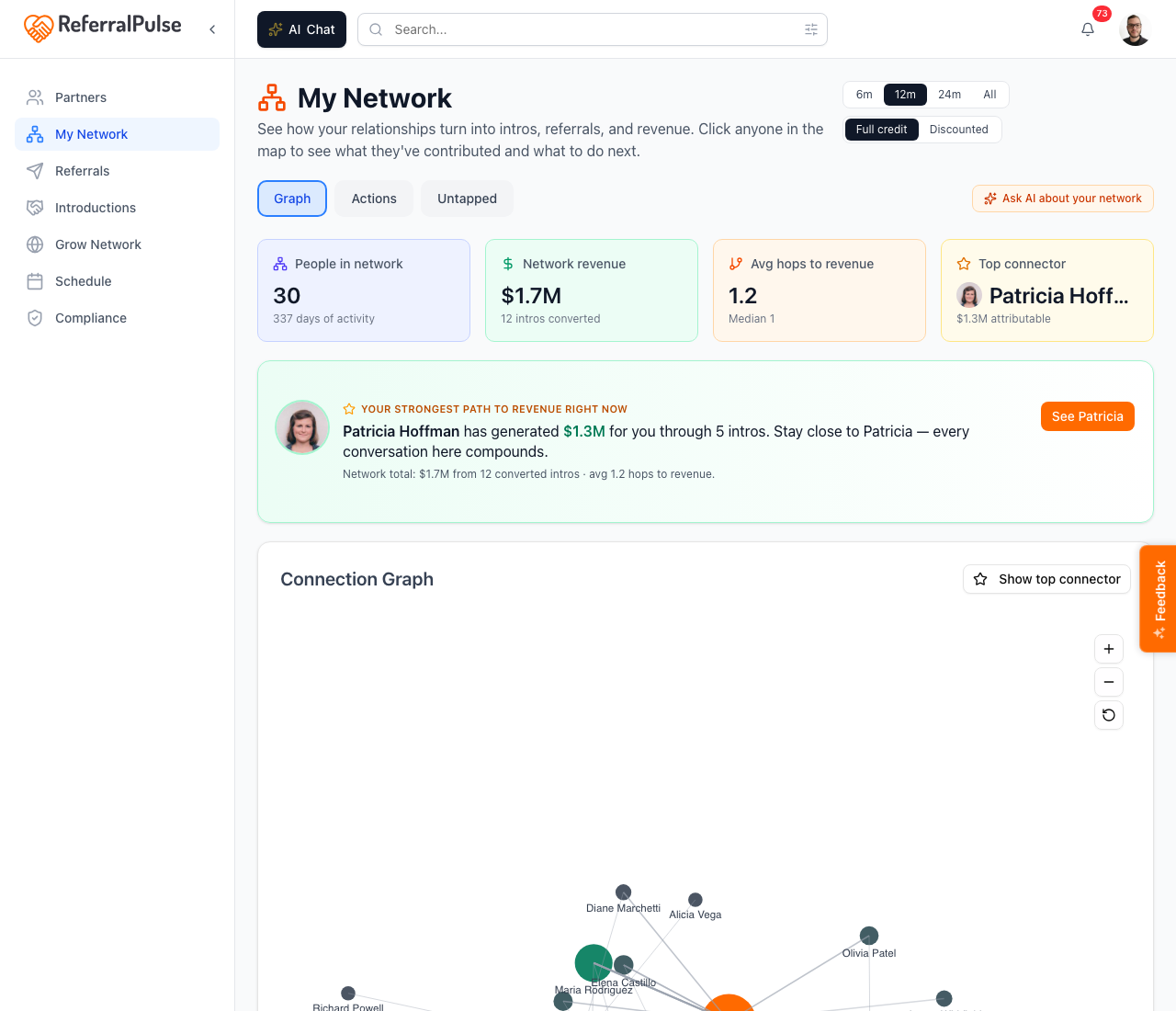
The graph plots:
- You as the center node.
- Each partner who's been part of an intro you made or received as an outer node.
- An edge between two nodes if there's been at least one intro between them.
Bigger nodes are partners who've contributed more. Lines that are thicker carry more dollars. Click any node to highlight everyone they've introduced you to and show that partner's contribution in the right-hand detail panel.
The two switchers in the top right
- Time window. The buttons 6m, 12m, 24m, All filter the graph to intros and revenue from that window. The default is 12m.
- Attribution mode. Two options:
- Full credit. Every connection in the chain gets full credit for downstream revenue. If A introduced you to B, who introduced you to C, who closed a deal worth $50k, both A and B get credit for the full $50k.
- Discounted. Closer connections get more credit. The further away the connection, the less it counts.
The default is Full credit, which is the right view for celebrating who in your network connected you to your best deals. Switch to Discounted when you want a single ranked list that doesn't double-count multi-hop introductions.
The most surprising number in this view is who your top connector is. Click the Show top connector button (top right of the graph) to highlight them. It's almost never the partner you'd guess off the top of your head.
Methods
Explore the graph
Where to find it: Graph tab → Connection Graph card.
Click any node and the right-hand Detail panel opens. It shows that partner's:
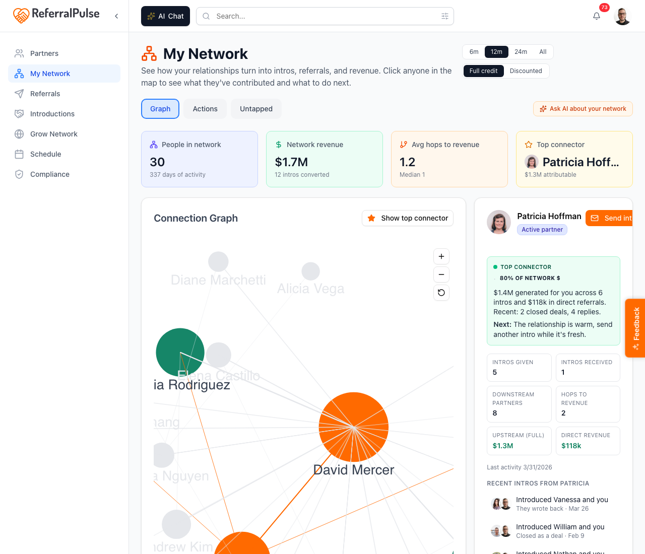
- Revenue contribution. How much downstream revenue you can attribute to this partner, in the current attribution mode.
- Intro count. How many intros they've made or been part of, given vs received.
- Story timeline. A chronological list of every intro that ran through them, who, when, what came of it.
Click another node to switch the panel to that partner. Click the same node again, or click empty space, to deselect.
Below the graph, the Top Connectors list ranks the 25 partners contributing most revenue, so you can compare the picture to a sortable list.
If the graph looks empty or has only one node (you), it's because you haven't logged enough intros yet. Add a few past intros from the Introductions section or import them in bulk from the Build Out Your Network screen, and the graph fills in.
See the action queue for your network
Where to find it: My Network → Actions tab.
The Actions tab is the what should I do about my network this week view. Cards stack down the page:
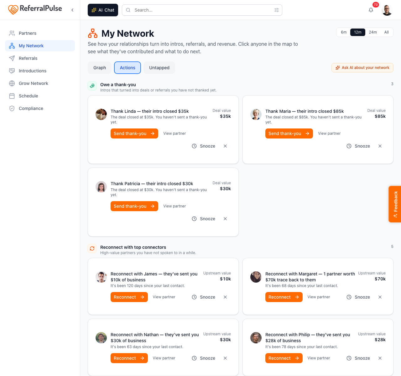
- Thank a connector. Partners who recently made a successful intro that converted, with a draft thank-you ready for you to send.
- Follow up. Partners who introduced you to someone and you haven't acted on the intro yet.
- Reconnect. Partners you used to exchange intros with regularly who've gone quiet.
Each card has a clear button (Send thanks, Open intro, etc.) that takes you straight to the action.
The Actions tab is more useful than the Graph tab for daily work. The graph is for understanding your network, the Actions tab is for moving on it.
Find partners worth activating on the Untapped tab
Where to find it: My Network → Untapped tab.
This is the lookalike view. Your assistant looks at your top connectors (the partners who've actually contributed revenue and intros) and finds people in your contacts, your calendar, and your imported network who match their profile but haven't been activated yet.
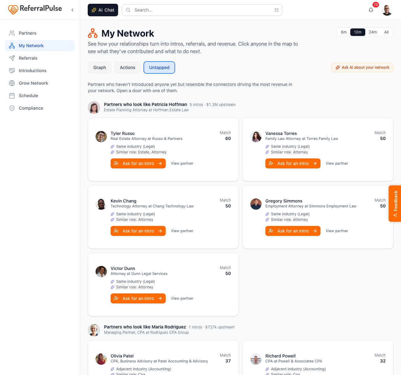
Each lookalike card shows the partner, the top connector they resemble, and a button to start an intro or schedule a reach-out. This is the most direct path from "look at the graph" to "do something useful."
Lookalikes are most valuable in the first few months on ReferralPulse, when your assistant has enough data on your top connectors to recognize the pattern. Come back to this tab once a month, you'll usually find one or two partners worth a coffee.
Get more out of your assistant
The graph and the lookalikes both depend on your assistant having good data:
- Log past intros. The graph is built from your introduction history. The more intros you've logged (especially older ones with outcomes), the richer the graph.
- Mark intros as won when they convert. Without an outcome, an intro is just a meeting. Add the dollar value when a deal closes.
- Keep your partner profiles current. The lookalikes use type of business, expertise, and Desired Referral Partner Types to find matches. Stale profiles produce weak suggestions.
The Ask AI about your network button at the top of the page (orange, with a sparkles icon) opens the chat panel pre-loaded with your network context. Ask things like "Who in my network has gone quiet?" or "Which partner has introduced me to the most attorneys?" and the assistant answers from the same data the graph is built on.
On the iOS app
Where to find it: Bottom navigation → Profile tab → My Network, or ask your assistant.
On iOS the graph collapses to a stacked layout: the graph card on top, the detail panel below it when a partner is selected. Tapping a node selects it the same way clicking does on desktop. The Actions and Untapped tabs use the same vertical card stacks as desktop.
For ad-hoc questions the chat path is faster. Try "Who's my top connector this year?" or "Show me partners who've gone quiet."
The graph is most readable on a tablet or desktop. On a phone, the Actions tab is usually the better view because the cards are sized for a vertical screen.