Reports
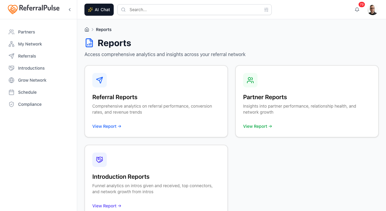
Reports is where the numbers live. The page opens with the handful of figures worth seeing without clicking anything, and a catalog of ten deeper reports underneath. Each one carries a year or more of trend data and the breakdowns you would want before a quarterly review or a networking group conversation.
Where to find it
Where to find it: Sidebar → Network Health → Reports. Direct URL: /dashboard/reports.
The cards at the top
These are live, not links. You read them where they are:
- Revenue by month. Won deals, annualized, over the current period.
- Commissions outstanding. Won deals with a referral fee that has not settled, with your net position.
- Pipeline health. Where every referral stands right now.
- Top referral partners. Ranked by how many referrals have passed between you.
- Work by service. Which kinds of work your referrals are for.
- Anything that needs you. A way straight through to Alerts & Tasks, where actions, tasks and alerts live together.
The catalog
Below the cards, All reports lists all ten, filterable by All, Revenue, Relationships and Compliance:
- Commissions. Who owes you and who you owe, with aging by how long each won deal has gone unpaid. See Commissions and referral fees for how the numbers are tracked.
- Referral Reports. Analytics on referral performance, conversion rates and revenue trends, filterable by service and tier. Covered below.
- Partner Reports. Insights into partner performance, relationship health and network growth. Covered below.
- Partner Segments. Which types of partners generate the most business, by how you met, profession, specialty, tier or group.
- Connectors. Your top connectors ranked by the downstream revenue their introductions set in motion, not just direct business.
- Referral Flow. Which professions send you business and which you send to, and where reciprocity is out of balance.
- Ecosystem Map. Pick a connector and see who they introduced you to by profession, and which connections became referrals.
- Ecosystems to Replicate. Which connectors convert reliably into referrals, so you know which patterns to build more of.
- Introduction Reports. Funnel analytics on intros given and received, top connectors, and network growth from intros. Covered below.
- Compliance. Arrangements, disclosures and license checks, with the alerts that need clearing. Only shown when commissions are part of your practice.
Once you are inside a report, the switcher at the top moves you between them without going back to the catalog. It is faster than the back button when you are comparing two.
Open Referral Reports
Where to find it: Sidebar → Network Health → Reports → Referral Reports.
The deepest report, built around "where do my referrals come from, what are they worth, and where do they get stuck." Filters at the top narrow to a service or a partner tier.
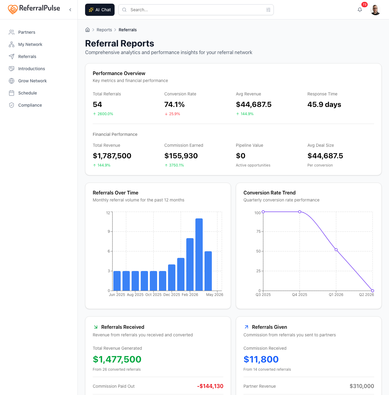
The cards, top to bottom:
- Referrals by month and Conversion by quarter. Volume, and the share that turned into won work.
- Money over time. Revenue and commission across the window.
- Work you took on and Work you sent out. The two directions kept apart, so you can see which side of your network is doing the work and what each side cost or earned.
- Where referrals stand. Every referral in the window, by outcome, with the ones getting old called out.
- Where they drop off. The share of referrals reaching each stage.
- How long things take. Deal velocity, and which months convert best.
- Top referral partners. Ranked by how many referrals passed between you.
- Work by service. Which kinds of work your referrals are for.
- Where you met them. What each place and event has actually been worth.
- Latest referrals. The ten most recent, both directions.
Where referrals stand is the Monday-morning card. The deals getting old are the ones most likely to slip without a nudge, and the dollar figure next to each tells you what is at stake.
Use the tier filter to compare referrals from your top-tier partners against everyone else. If you have tiered by relationship strength, that comparison tells you whether the investment is paying off.
Open Partner Reports
Where to find it: Sidebar → Network Health → Reports → Partner Reports.
The same depth, for your network rather than your pipeline: how it is made up, how it is growing, and who has gone quiet.
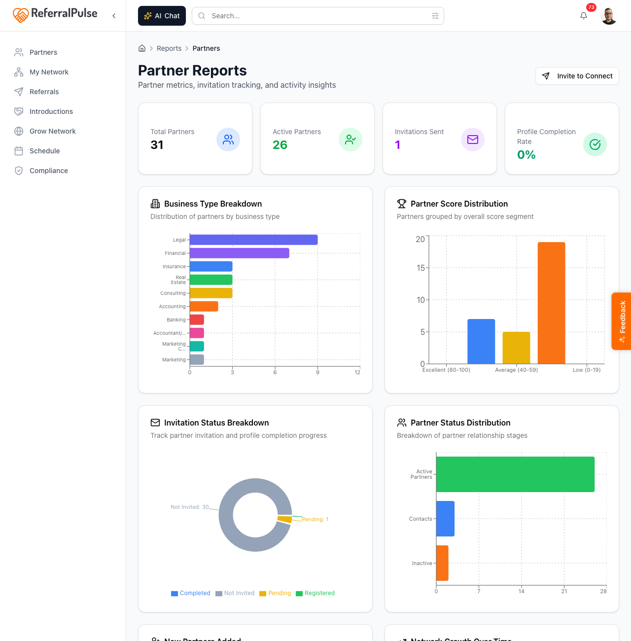
- At a glance. The headline counts for your network.
- Partners added and Network size. New partners each month, and the running total.
- What your partners do. Your ten most common lines of business. Useful for spotting gaps, like no estate planning attorney, and over-concentration, like sixteen financial advisors.
- Relationship strength. Partners grouped by how strong the relationship is.
- Invitations and Recent invitations. How far partners have got with their own profiles, and the last ten you asked.
- Tiers. How your partners are spread across your ladder. If you have not set tiers up yet, it points you at the place to create them.
- Where your partners stand. Grouped by how much business has passed and how recently you spoke, which is where the dormant relationships surface.
The imbalanced group is where the relationship work is. A partner who has sent you five referrals while you have sent none back is a relationship at risk, and the report names them.
Open Introduction Reports
Where to find it: Sidebar → Network Health → Reports → Introduction Reports.
The funnel-and-network view of intros made and received. A time-window switch at the top controls the whole page.
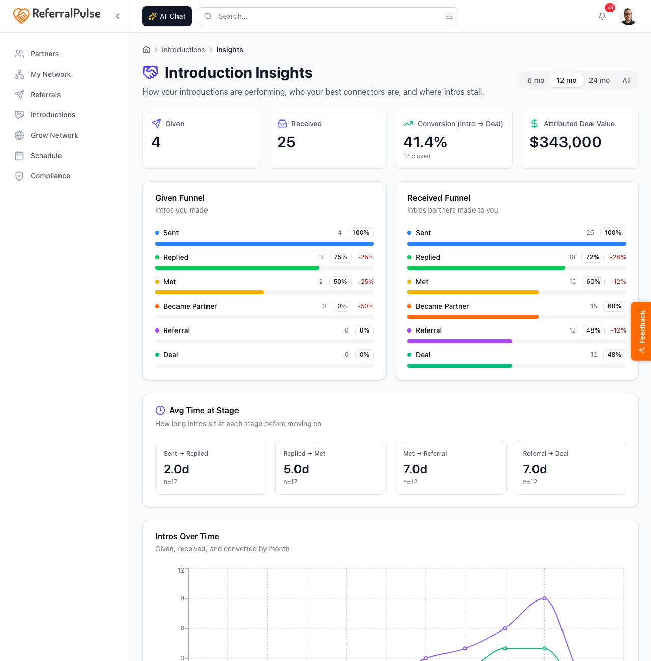
- Intros you made and Intros made to you. Two funnels side by side, showing every step each direction has reached.
- How long each step takes. Average days from one step to the next, with amber where a step is running longer than it should.
- Introductions over time. Given, received and converted, by the month the intro was sent.
- Top connectors and Who you introduce most. The partners who introduce you to new people, and the people you put in front of others.
- Where intros come from. How each introduction on file got here.
- Network growth from intros. How many of your partners you have because somebody introduced you.
If introductions are central to how you build your network, this is the report to bring to a quarterly review. The top-connector list is the part that surprises people, because it is rarely who you would have named.
Get more out of your assistant
The reports above are the static view. For ad-hoc questions, talk to your assistant directly. It can answer questions the report pages don't expose:
- "Which partners haven't sent me a referral this year?"
- "What's my conversion rate on referrals from CPAs versus from attorneys?"
- "Show me the deals over fifty thousand that are still open."
Your assistant runs each question against your live data and answers in plain English with the specific records pulled out. Reports are best for pattern-spotting; your assistant is best for one-off questions.
On the iOS app
Where to find it: Open Reports from your profile menu, or ask your assistant.
On iOS the reports render in a stacked, mobile-friendly layout. Most people open them less often on a phone. The faster path is to ask your assistant in the Chat tab. Saying "how am I doing this quarter" usually surfaces the headline numbers without you having to navigate.
The reports load fresh on each visit. If you log a referral or update a status and want to see it reflected in the numbers, give it a few seconds and refresh.